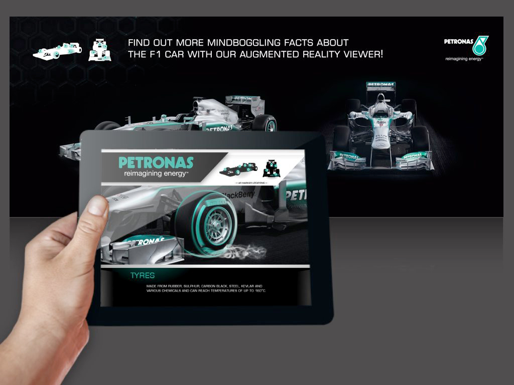
Year 2011, coding my first website integrating the 1st prototype augmented reality using Flash. ↓↓ Love this custom remix song by composer met in Indonesia. ↓↓
Amazing experiences start from a typical story.
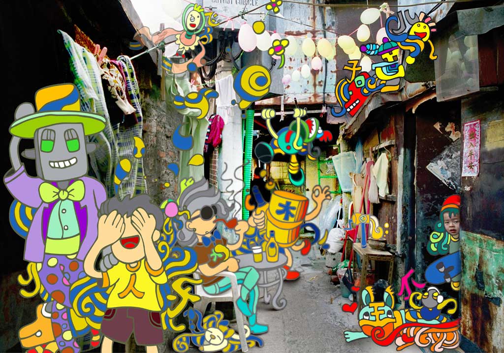
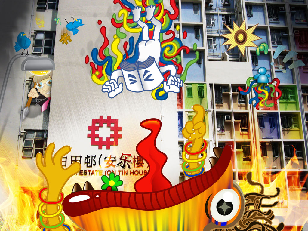
showcase lots of behind the scene work and more work in progress came along the way
Learning trick and tips beyond just design
augmented reality become a trend, could be a norm yet still interesting
An unforgetable testimonial
starting up is not easy, but is much like a memorable experience